
5 Powerful Uses Of Red in K-Pop Design
Posted: Jan 25, 2022
Written by: Kelly Nero
As Valentine’s Day nears, the color red is on many of our minds. In design, it can be a designer’s best friend by accenting what we want to highlight. But if used too much, it’s impact can be a deterrence to the viewer. It’s diverse range of meanings & connotations can change depending on what shade or tint of the hue you use as seen in these K-Pop visuals.
5. BTS - Danger
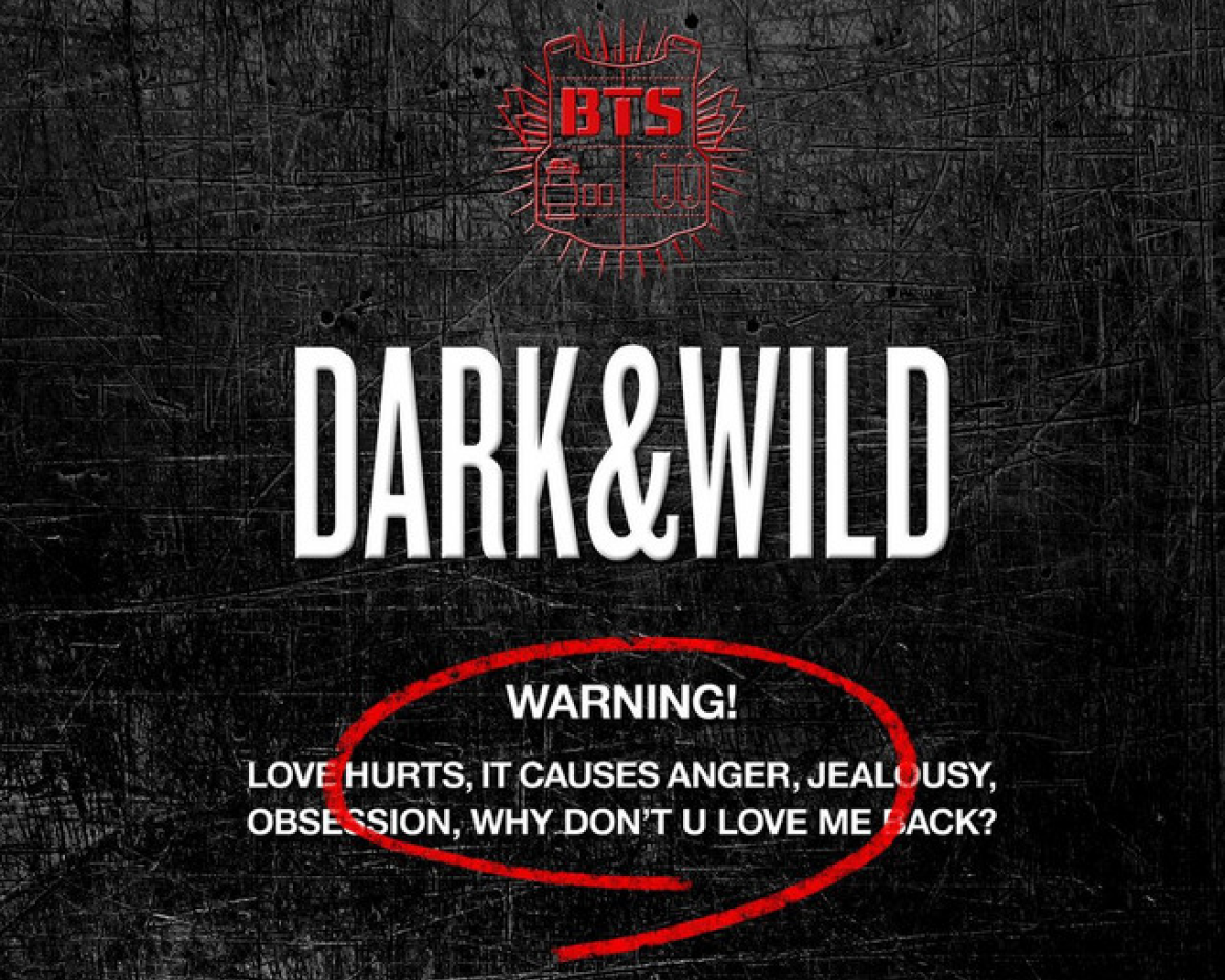
Cover art for BTS' - Danger
Love. Hurt. Anger. No perfect color to choose than red. The 2014 song by the iconic group, BTS, is an angsty hip hop song about a one-sided teenage relationship. What says teenage angst better than red and black? (MCR fans anyone?). In the design of the cover art, there's only 2 red assets: the BTS logo and the re circle around the warning. With only covering 20% of the design, red is the focal point,summing up all of the broken-hearted and hurt emotions perfectly.
4. SISTAR - Alone

Individual teasers (top) and Album Cover for 'ALONE' by SISTAR
It can arguably be said that no girl group has done sexy better than SISTAR. It can also be argued there is no sexier color than red (other than black). Not surprising that the girl group utilizes both colors in the promotion for the hot single 'Alone'. The song was the group's sexy comeback and soon it became iconic for the tantalizing red dresses and dance performance. What I think is utterly brilliant is the red used in the teasers. It reminds me of the perfect red lipstick that has become a symbol for feminine sexuality over decades. Whoa.
3. Red Velvet - The ReVe Festivale

All 3 album covers for The ReVe Festival by Red Velvet
Named after the group and the French word for 'dream' or fantasy, the cover art for the Red Velvet's ReVe Festival collection depict dreamlike sceneries in the signature style of the group: bold & colorful. Similar to BTS's Danger cover art, the cover art employs red as the focal point of the designs. In all three pieces there's a burst of rich and bright colors going on, but red proves its dominance in all of them. The viewers eye is immediately drawn to the red focal pieces, thanks to the center placement, size, and red hue.
2. CL - Lover Like Me

Teasers for CL's - Lover Like Me
Lover Like Me is soloist CL’s second pre-released single from her 2021 first full-length album, Alpha. The song has an empowering message surrounding a breakup, realizing there is no other lover like her, so their loss. At first glance, the color of her dress may not seem as important to the message, but in fact it’s the most crucial part of it. Red is a color of power, bravery, and courage, often used in national flags and achievement patches. CL proudly wears the newfound sense of power she has after realizing she’s THAT girl.
1. G-Dragon - Coup D'etat

Teaser (red ver.) and Album package design fro GD's 'Coup D'etat
Regarding this song & album of the same name, G-Dragon stated “the meaning of ‘Coup D’Etat’ is rebellion, it’s overthrowing a government. Just perceiving the world, I wrote the lyrics with that in mind. I want to continuously instigate, whatever it may be.” And that he did. The saturated red is very alarming and glaring. It’s everywhere. Just look at the album packaging. Red again symbolizes power here, but with much more energy & aggression than before (necessary for a rebellion of course). Black symbolizing death, and white symbolizing birth, the three colors paired give a very metaphorical meaning to a coup d’etat, which is essentially the death of an old way of doing things and the birth of a more powerful one.
Related Post


Follow Us!
Some text..